A Thousand Words
This essay was originally published in The ThoughtWorks Anthology, Volume 2.
Data is no longer scarce. Insight is. Twitter clocks over 36,000 tweets a minute. Tesco generates over 2 million records of transaction data every day. By the time you’re done reading this page, YouTubers will have uploaded over 20 hours of video online. And as more companies integrate their systems or embrace the semantic web, it’s becoming increasingly difficult to make sense of all the information out there.
A lot of what we do at ThoughtWorks is help our customers integrate, simplify, and capitalize on these systems and the massive amounts of data they hold, and we rely on information visualization, or infovis. Information visualization will play an increasingly important role in dealing with the dataglut. The potent combination of images, words, and numbers—done right—can provide the most meaningful insight into our data. The question is, how do we determine that magic combination? The common misconception is that this task is best left to the designers or aesthetically inclined on the team. But while creative thinking is required, there needs to be method to the designers’ madness: a structured way of approaching the visualization problem, in which form follows function. A team that employs visualizations and a visualization design process is well on its way to building more innovative and valuable software.
The goal of this essay is to help demystify information visualization and share some of the structured thinking that goes into designing visualizations. I hope it motivates you to understand infovis and develop a shared vocabulary with others to discuss and create better visualizations.
Smelling the Coffee
Much infovis work is driven by scientific and academic research. That’s fortunate, because infovis is directly linked to human visual perception, which science has learned a lot about in the last century.
What’s unfortunate is that the same can’t be said wholeheartedly about the IT industry, as its progress in this space is driven less by the objective research conducted in the field and more by the deals between software vendors and CIOs on golf courses. The IT industry has made real advances in data-centric activities like collecting, cleaning, transforming, integrating, and storing data, but it still lags behind in the human-centric analysis of that data. The brutal truth is that many of the BI tools out there won’t withstand the slightest scrutiny when evaluated from the lens of current research in visual perception, design, and effective visual communication.
To fork Daniel Pink’s famous quote, there is a big gap between what science knows and what businesses are doing. As a result, many of us have given in to the status quo of tabular applications, pie chart presentations, and paginated data. But not all of us. Stephen Few, a contemporary expert in business-infovis, says, “Few situations frustrate me more than good infovis research that could solve real problems but remains unknown and unused because it has never been presented to those who need it or has been presented only in ways that people can’t understand.”
But there are encouraging signs. Infovis is not a new field. Visually communicating information has been around for as long as humans have been telling stories. And there is a resurgence taking place right now toward leveraging infovis in new and deeper ways to address the plethora of data we’re overloaded with in this Information Age. Many industries and organizations already understand the value that infovis brings to the table and are using it to solve challenging problems.
When ThoughtWorks is brought in for assessments of large-scale IT projects facing difficulties, we first use the latest research in internal software quality measurement and infovis to diagnose the current “health” of the system. As you can imagine, information that comes in such a complex form—a spaghetti of architectures, hundreds of thousands of lines of code, and years of human decisions and implementation history—is not easy to analyze. This is why we rely on good infovis practices to excavate the insight that helps top-level decision-makers make the right choices.
Similarly, the New York Times has earned a reputation for telling insightful stories about the world by revealing patterns and relationships in the light of current events. Today’s cutting-edge retail analytics companies, such as those working with loyalty programs, use infovis extensively to help retailers “perfectly” price, promote, and place products in their stores based on consumer-buying habits and loyalty. And now with the widespread adoption of touch-screen media and small-screen ubiquitous interfaces, we’re being pushed to find even more innovative ways to visualize information.
So what are some of the winning design principles in information visualization?
Visualization Design Principles
“Evidence is evidence, whether words, numbers, images, diagrams, still or moving,” says Edward Tufte, the design and infovis guru. “The information doesn’t care what it is, the content doesn’t care what it is. It is all information.” The goal of information visualization is to help us think more productively and analyze information more efficiently. In discussing the ways to reach these goals, it’s worth keeping the following principles in mind:
-
Increase information density: Not everything in a visualization has a purpose. Charts, especially Microsoft’s auto-generated ones, are often littered with what Tufte calls “chart junk”—visual elements that communicate nothing about the information. Another way to think about this principle is in terms of maximizing data-ink ratio: the ratio of ink (or pixels) that encode meaningful information about the data vs. the total ink (or pixels) used. Typical bad examples are 3D bar charts, graphs with useless pictorial backgrounds, redundant gridlines and overused icons. Resist redundant bells and whistles and be more cognizant of how you use each pixel.
-
Leverage visual thinking: the human vision system is wired to recognize features and patterns in everything it sees, much of it before you even get to “think” about (aka attentively process) the visual information. If we visually represent our information just the right way to exploit our pre-wired visual processing, we allow the viewer to analyze the information more efficiently and by “thinking” less. This is the quintessence of human-centric analysis and what most of this essay will focus on. We’ll see how a structured visualization design process helps maximize visual thinking to make us analyze information more productively.
-
The content is the interface: visual thinking addresses the reading, or consumption, of information; but consuming isn’t enough. We want to interact with our data. The human-centric approach to this is to create natural and immersive interfaces. When you use Google Maps on the iPhone/iPad, the gestures of pinching, swiping and tapping the map feel natural. The direct manipulation and immediate feedback from interacting with the map is an example of the content being the interface. While not as effective, this principle is just as important for mouse-controlled displays: think context-sensitive tooltips, linked highlighting, overlays, and animated transitions. The goal of this principle is make the content the focus of attention, to the point that the tool simply “disappears.”
The Visualization Design Process
For the most part, the process of designing visualizations touches on all parts of the software development value stream. That’s because at the end of the day, information visualization is simply the process of transforming data into an interactive visual representation, either through code or a tool. Several people have spent the time to define structured processes for creating visualizations—Pipeline Model (Agrawala), Cyclical Model (Wijk), Nested Model (Munzner). Because some of these processes were initially described in research papers, they can be unnecessarily cryptic (at least for most of us) and give the impression that their authors were trying really hard to impress the reader (one of them even uses calculus!)
Cutting through the cruft of unnecessary complexity, the essence of the visualization design processes is shown in figure fig.ali.process.
 Figure fig.ali.process
Define Domain Tasks
A good visualization always starts by articulating a need in the business’s natural domain language. Borrowing from the Agile methodology, one way to articulate those needs can be in the form of user stories, such as: “As a school teacher, I want to know how well my students are doing in my class, so that I can plan the mid-term review session accordingly.”
Task Abstraction
Obviously, knowing how well students are doing in class can be measured in many ways. I may want to determine the average performance of the class. I may want to know the extent to which those grades vary across students, topics or over time. I may want to see who has been absent when I taught things that aren’t covered in their textbook. I may want to know the topics that students are having most difficulty with. Do you see a similarity between the tasks the teacher is trying to perform and the tasks a project manager, financial analyst or anybody else performs on a daily basis? That’s because analytical tasks are usually just instances or a mix of a few well-known abstract tasks performed on one or more metrics. Most of those are:
-
Filter: Find data that satisfies conditions.
-
Find Extremum: Find data with extreme values.
-
Sort: Rank data according to some metric.
-
Determine Range: Find the span of data values.
-
Find Anomalies: Find outliers and data with unexpected values.
-
Characterize Distribution: Determine how the data is distributed over the spectrum of available information.
-
Cluster: Group similar items together.
-
Correlate: Recognize a relationship between two types of information.
-
Scan: Quickly review a set of items.
-
Set Operations: Find set intersections, unions, etc.
-
Retrieve Value: Look up a specific value based on some criteria.
The goal of task abstraction is to break the domain task down into a set of low-level abstract tasks/operations, preferably ranked by priority if possible. As we’ll see later, visually encoding your data effectively relies heavily on the analytical task(s) being addressed.
Data Abstraction
How many different ways can you give me the temperature of water? Taps give you two: hot and cold. You could also say it’s boiling, hot, luke warm, cold, or frozen. Or you could just call it out in degrees Fahrenheit/Celsius. How would you arrange the words “hot” and “cold” in order? How about boiling, cold, luke warm, hot, and frozen—which one comes first? Try -1°C, 10°C, and 4°C. The way in which we represent our data has a profound implication on how we cognitively process it, especially when visualized. Before we start to visually encode data, we need to understand the nature of each metric (aka data type) in it. There are three essential data types we need to know about:
-
Nominal data: categorical data in which the order does not matter, e.g. apples vs. oranges; departments of sales, engineering, marketing, accounting.
-
Ordinal data: data in which the order matters but not the degree of difference between the values. Customer satisfaction measured as “very satisfied”, “satisfied”, “neutral”, “unsatisfied”, and “very unsatisfied” does not indicate how much more or less satisfied one is than another. Likewise, representing the winners of a race as 1st, 2nd, and 3rd doesn’t indicate the difference in race times associated with the positions.
-
Quantitative data: numerical data in which the difference between the values is meaningful, e.g. 1cm, 10cm, 20cm. Quantitative data is sometimes further categorized into interval data and ratio data to indicate the existence of an explicit 0-point, but we’ll keep it simple here.
Sometimes we get the choice of transforming data types from our dataset based on our task abstractions. You might be wondering why or when you would want to do that. Two common scenarios are:
-
A task requires making some assumptions about the data set in order to aggregate information, like calculating averages and sums. For example, an Agile team might assign quantitative values to t-shirt-sized effort estimates of user stories based on geometric progression (e.g. S=1, M=2, L=4, XL=8) in order to quantify the project scope.
-
A task does not require precision in order to be performed effectively. For example, the task of determining which employees submitted their timesheets late might not need to know how late the submissions were. This is where design perfection comes in and why it’s so important to clearly articulate your tasks. Companies like Apple get this because they share the following sentiment:
A designer knows he has achieved perfection not when there is nothing left to add, but when there is nothing left to take away. -Antoine de Saint-Exupery
Understanding your data types and choosing the right level of abstraction (i.e. data types) from your dataset based on tasks is one of the key ingredients to effectively visualizing data. For example, the following visualizations are two different ways of showing your company’s brand power (weak, medium, strong) and revenue by city. Without giving you any extra information about the bar chart on the left (A), can you guess in which city you’re generating the most revenue with the weakest brand power:
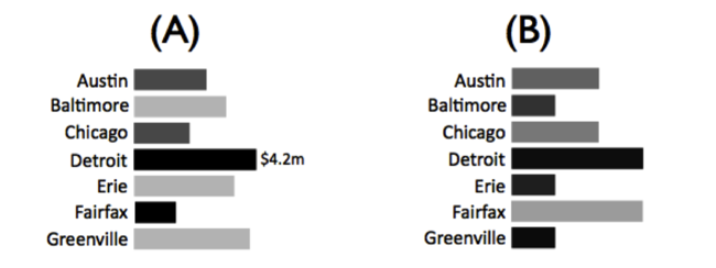
Chances are you guessed Greenville because it has the longest bar among the lightest ones. There are a couple of things at play here. First, humans intuitively associate variations in color intensity (how light or dark something is) with ordinal data (brand power). Plus, our vision system is very good at differentiating color intensity (up to a limit). Similarly, our vision system is tuned to discerning the smallest of differences in lengths of objects, which makes length a great choice for visually representing (aka visually encoding) quantitative data types—revenue in this case. If I were to switch the visual encodings around—shown in (B)—and use length for brand power and color intensity for revenue, it would be a lot more difficult, if not impossible, to perform the same task.
In fact, you can try to ask any question for this data and the first visualization will invariably do a better job at answering it, even if I gave you a detailed legend for the second one. Leveraging our visual powers to rapidly perceive information based on the task and data abstractions allows us to pack more information in less space as well as detect patterns that would otherwise have to be processed by the left side of our brain (the analytical and sequential side). This is precisely what the next step of visual encoding tries to achieve.
Visual Encoding
Simply put, visual encoding is the process of mapping data onto our visual field, usually on 2-D surfaces. Effective visual encoding requires some understanding of how vision works in the first place. As with many of the topics in this essay, I can’t do justice to the depth of this topic in a few paragraphs. But for the purpose of this essay, here’s all we need to understand: visual perception is essentially a three-stage process:
-
Feature extraction
-
Pattern perception
-
Goal-directed processing
In the first stage of feature extraction, millions of neurons work in parallel to detect primitive visual features like color, form, and motion. This is best explained by a typical example: how many 3s do you see in the following set of numbers?

How long did that take you? There should be five. Now try it again:

Obviously that was a lot easier, thanks to the first stage of feature extraction during which your vision system did some of the thinking for you, also known as preattentive processing. Making something lighter or darker (i.e. changing its color intensity) is one way of visually encoding information for preattentive processing, which is why color intensity is also referred to as a “preattentive attribute.” The reason it was more difficult the first time is that the shapes of numbers are complex objects that your brain can’t preattentively process. In his book Information Visualization: Visual Thinking for Design, Colin Ware suggests 17 preattentive attributes. The most relevant ones, narrowed down by Stephen Few in Information Dashboard Design, are shown in figure fig.ali.encodings.
 Figure fig.ali.encodings
In the second stage of pattern perception, our brain segments the visual world into distinct regions and discovers the structure of objects and the connections between them. It’s only in the third stage that the information is processed by our brain’s attentive processes to perform the analytical task at hand.
Our goal is to make the most of the first two stages; to let the preattentive processing do some thinking on our behalf and to convey information in big visual gulps so that we can understand our data more efficiently.
Encoding for Feature Extraction
It turns out that the effectiveness of these attributes varies based on the data type you want to encode. So how do we know which ones to pick for what? I find Mackinlay’s rankings (figure fig.ali.mackinlay) easiest to elucidate the concept because they also show how the effectiveness varies by data type.
 Figure fig.ali.mackinlay
For novices like myself, this is the holy grail of visualization design. Take a minute to explore the rankings and relate them to your own experience. As you can see, 2-D position is at the top of the list for all types. This is why traditional X-Y graphs are so effective at conveying so many kinds of information. Also notice how length and density (previously called color intensity) vary for quantitative and ordinal data types, a fact used in the example of brand power and cities given earlier.
Let’s use these rankings to evaluate a common myth about the effectiveness of pie charts for quantitative comparisons. Pie charts use area and angle as means to convey quantitative data. However, based on the rankings, both length and position trump area and angle. Let’s see for ourselves: using the pie chart, can you tell which software feature is costing you the most to build?
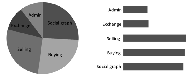
Probably not. It’s clearly easier to answer that question using the bar chart instead. Arguably, pie charts are effective for visualizing part-to-whole relationships, such as the fact that three of the above features cost approximately 25% each, but that’s about it. If the task at hand requires more information that’s just as important for your tasks, such as comparing or ranking the parts, you should encode your data differently.
Picking the most effective encodings relies heavily on the task at hand, so even the encoding rankings should be seen in that light. Also keep in mind that you can encode a data type with more than one visual channel to help perform the task more efficiently. For example you could encode a quantitative temperature with length, hue (blue or red), and intensity (diverging from light to dark in both directions—hot and cold.)
Encoding for Pattern Recognition
The Gestalt principles of visual perception are very useful for grouping, linking, and distinguishing information in visualizations using our vision system’s second stage of pattern recognition. For example, you might want to guide the user toward scanning information horizontally versus vertically. You could do this simply by putting slightly more vertical than horizontal spacing to help the viewer group the information preattentively. This phenomenon is explained by the Gestalt principle of proximity, since the objects placed closer to each other are perceived as belonging to the same group. Or you could just group the information with lines or borders, using the principle of enclosure. The six Gestalt principles are best explained using visual examples (figure fig.ali.gestalt):
 Figure fig.ali.gestalt
-
Proximity: we see three rows of dots instead of four columns of dots because they are closer horizontally than vertically.
-
Similarity: we see similar looking objects as part of the same group.
-
Enclosure: we group the first four and and last four dots as two rows instead of eight dots.
-
Closure: we automatically close the square and circle instead of seeing three disconnected paths.
-
Continuity: we see one continuous path instead of three arbitrary ones.
-
Connection: we group the connected dots as belonging to the same group.
The reason scatter plots are so effective in helping us spot correlation in our information is that the laws of proximity, continuity and similarity allow us to group and fill in the blanks in our data. figure fig.ali.scatterplot shows a visualization inspired by Hans Rosling’s famous TED talk on “New insights into poverty.”link
 Figure fig.ali.scatterplot
Notice how the arrangement of the dots appears to us naturally as a line. Despite the “noise” from variance, we’re still able to visually establish some correlation between income per person and life expectancy at birth. The correlation is even more evident when the visualization is played as a motion chart, showing change over time. If you haven’t already, I highly recommend watching the talk and asking yourself if you could tell the same story as effectively with just numbers and words.
Evaluate and Refine
As with any good software development process, feedback loops in the process are critical. It’s beyond the scope of this essay to delve into the feedback process for software in general. But in infovis, some testing can be conducted fairly objectively with users. Some things to keep in mind:
-
Incorporate feedback very early and often throughout all stages of development using visual prototypes. Don’t underestimate the power of paper sketch testing. Avoid developing “The Perfect Visualization” in the dark only to pull the curtains on something that does not address the domain problem effectively.
-
Measuring the time it takes to perform the finer-grained tasks that make up the domain tasks can be useful for testing a set of different encodings for the same information.
-
Try creating a battery of test scenarios for different data sets to see how the effectiveness of your encodings in solving the tasks varies.
-
Even though we didn’t talk about the quality and truthfulness of the data being visualized, remember that data and metrics aren’t always right (a la “lies, damn lies, and statistics”). As such, they should be taken with a grain of salt; project management and code quality metrics being good examples. Sometimes spotting trends and outliers is more important than tracking absolute numbers, which infovis is great for.
-
Understand that there is always an element of subjectivity in user experience due to aesthetic preferences and opinions.
Visualization Design Patterns
Now that we have a basic understanding of the low-level visualization design process, it’s worth taking a look at a small sample of common visualizations for common tasks and get a feel for what’s out there. I’m using the word “design patterns” loosely here, from the perspective that they provide a reusable visualization skeleton for common tasks and data sets by providing some predefined encodings, and leave the rest up to the designer.
As with any design pattern, I want to caution you that there is no silver bullet. Before using any of these, it is imperative to articulate the tasks and let those tasks guide you. It can be very tempting to slap a beautiful-looking horizon graph for a small data set on your page when all you need is a simple time series chart. Similarly, always ask yourself if a table can help perform some task (e.g. lookups) more effectively.
Exploring Change over Time
Asking our data if something is increasing, decreasing, or remaining stable over time is a very common task. In general, lines do a good job of visually representing time because they adhere to our general perception of time being a continuous entity. Changes through time can be detected by the (preattentively processed) angle of upward and downward slopes that give the data shape.
-
Line graphs: encode time and one or more dependent variables with 2-D position.
-
Stack graphs (aka Finger Charts): work like a line graph for multiple metrics, additionally encoding differences in those metrics with area. One example of its effective use is for spotting bottlenecks in a value stream (e.g. analysis, development, QA, business signoff in a software development process) by plotting the work completed over time and looking for areas in time that are relatively smaller than their counterparts. A derivative of a stack graph is the steam graph, where the baseline (0-point) is allowed to move freely on the y-axis. The music recommendation service Last.fm uses steamgraphs to visualize listening trends.
-
Horizon graphs: shown in figure fig.ali.horizongraph, a horizon graph is a better choice for visualizing a large set of time series data, such as the performance of 30 stocks over a year. It’s a form of time series graph that uses color intensity and area to make us perceive a larger range of y-axis values without stretching the height of the graph. One of the interesting properties of color is that humans tend to overestimate the area of shapes with intense, saturated colors. A horizon graph leverages this phenomena to pack more information in a smaller space, keeping the height of the graph constant. Large quantitative values are encoded with layers of area under a line with varying color. In addition, it mirrors negative values onto the positive axis with a different color (e.g. red for negative and blue for positive.)
-
Sparklines: shown in figure fig.ali.ganalytics, Edward Tufte, a well know expert on visual information design, says that sparklines are intended to be “small, high resolution graphics embedded in a context of words, numbers and images”. Sparklines have become very common over the last few years and usually show up in the form of small multiples. They are particularly relevant in dashboards, such as the one provided by Google Analytics fortracking website traffic.
 Figure fig.ali.horizongraph
 Figure fig.ali.ganalytics
Exploring Correlations
We’re not always trying to measure change over time. Sometimes we need to explore the correlation between nominal and ordinal data types. Often times the analysis involves many more conditions and variables too (aka multivariate data). Two commonly used patterns for this are:
-
Scatterplots: we saw an example of these in figure fig.ali.scatterplot. By the same token, scatterplots are great for spotting outliers and anomalies. In its most basic form, a scatterplot uses 2D position to encode quantitative data. However, it provides a lot more encoding options for multivariate data, e.g. size/area, shape, color, and enclosure, which is why bubble charts are just a derivative of scatterplots.
-
Matrices: a matrix works like a scatter plot but divides the 2D space into a grid to accommodate nominal and ordinal data types. Two common forms for exploring correlations are matrix charts and heat matrices. A typical example of a matrix chart is feature comparisons for competing products. A heat matrix (figure fig.ali.heatmatrix), like a heat map (figure fig.ali.heatmap), encodes a quantitative or ordinal of interest (represented as a node on the grid) with color. Unlike a heat map, a heat matrix focusses on establishing the correlation between two groups of information, so the 2D position of the node matters, for example showing the profitability of a retail company across product lines (nominal) and regions (nominal).
 Figure fig.ali.heatmatrix
Exploring Hierarchical and Part-to-whole Relationships
Thinking in terms of hierarchies and part-to-whole relationships is something we’re all good at because the physical world is filled with analogies for our mind to use. Your cell phone’s battery doesn’t drain like liquid in a container. Your computer’s folders of folders and files aren’t actually organized neatly that way on your hard drive. But the metaphors make it easy for us to work with the information. Likewise, visualizing information this way is just as helpful, especially for the tasks of clustering, finding anomalies and set operations. Aside from pie charts, two useful patterns for exploring part-to-whole relationships and hierarchical data are:
-
Treemaps: Treemaps are nested boxes inside boxes and you can encode metrics with the size and color of the boxes. An popular use of treemaps is to visualize code size and complexity based on the class or directory structure, which is what Panopticode does. Treemaps are most effective when the user can interact with them by drilling into and hovering over the rectangle representing the nominal data (e.g. class/file/directory).
-
Bullet graphs: shown in figure fig.ali.bulletgraph, a bullet graph is an alternative to speedometer gauges used in dashboards to visualize quantitative part-to-whole relationships, such as KPIs. Taking the example of a KPI, a bullet graph encodes the part and whole with lengths of varying hue, and varying-intensity lengths in the background for ordinal measures of performance like good, satisfactory and bad. The closest real-life analogy would be a thermometer.
 Figure fig.ali.bulletgraph
Exploring Connections and Networks
If you think about it, hierarchies and part-to-whole relationships express a specific type of connection between two or more things. For visualizing arbitrary interconnected relationships (including hierarchies and part-to-whole relationships), network graphs are a great option.
-
Network graphs: allow us to see connections, usually between nominal data, as a set of lines connecting nodes. Aside from the obvious options of visually encoding the nodes and lines, there are lots of ways to lay out the graph itself. Circular graphs aim to visualize a flat list of relationships. Hierarchical graphs use a tree-like layout. Multi-level force-directed graphs use some physics and spring heuristics to space out the nodes in the graph. There are others, too, but the choice really depends on the nature of the data and the task at hand.
-
Edge bundling: is a technique that gives more clarity to network graphs by visually bundling adjacent edges together instead of using the shortest linear path between two nodes, thus resembling a well-organized layout of network cables in a server room. figure fig.ali.edgebundling shows a visualization of code dependencies The effectiveness of this approach is clearly evident when you notice the increased line widths and color intensity of bundled connections in a graph.
 Figure fig.ali.edgebundling
 Figure fig.ali.heatmap
There are many other useful patterns in the wild. For example, you’ll find Heatmaps commonly used in the financial services industry to view the activity of the stock market in real time, as shown in figure fig.ali.heatmap. Keep an eye out for these patterns. Knowing their objectives and deconstructing the encodings and how they work will help you tailor/modify them for your own purpose. For the patterns I mentioned, you’ll find many tools and frameworks out there to will help you to quickly implement them too.
Tools and Frameworks
It’s becoming increasingly important, and easy, for us to implement our own custom visualizations and the more common patterns described above. I believe that the ease with which people can implement their own visualizations will play a key role in the adoption of good visualization design practices.
Visualization Libraries
Browsers are getting better at accommodating visually heavy interfaces, and the tools for making such interfaces are evolving in step. The things you can do with HTML5 canvas and JavaScript were once a perk that only Flash and Java Applets enjoyed, but now the landscape is changing. Some of those libraries are listed below. The best way to learn about your options is by visiting their websites, all of which have demo “galleries” and sample code:
-
d3.js: a successor to Protovis and led by members of the Stanford Visualization Group, d3 is one of the best open source Javascript-based visualization libraries out there. It gives you a powerful declarative, data-driven fluent API and is well-grounded in good infovis practices and patterns. In addition to providing a custom visualization API with animation support, it allows you to implement many common customizable visualizations, including all of those mentioned earlier.
-
Processing: is a mature open source programming language for infovis built on top of Java. It was initially designed to produce Java applets but has now been ported for several other languages and platforms including Javascript (Processing.js) and Flash/ActionScript (Processing.as).
-
Raphaël: is a promising open source Javascript library that, like d3, uses the SVG WC3 Recommendation and VML for creating graphics. As with d3, you get all the standard browser-based functionality and mechanisms for implementing client-side interfaces, such as DOM manipulation and events. GitHub uses Raphaël to visualize some metrics about its source code repositories. Raphaël also comes with animation support.
-
Standard charting libraries: There is a multitude of charting and graphing libraries out there. These libraries aren’t as flexible as the ones mentioned earlier since they focus more on providing functionality around standard pre-canned visualizations. To name a few: Google Charts (image and Flash-based), Fusion Charts, flot (jQuery), JavaScript InfoVis Toolkit.
Graphical Tools
When it comes to graphical tools, my observation is that there aren’t as many generic infovis tools as there are more pattern-driven tools that let you create very specific visualizations. So you obviously don’t get as much flexibility here as you do with the infovis libraries discussed above. My experience with and knowledge of graphical tools is quite limited, so I can only recommend the following:
-
Tableau: is a flexible and generic visualization tool that is well aligned with the infovis design process discussed earlier. Measures, or data values of any type, can be visually encoded with a set of supported encodings, such as color, length, and area. Tableau also has good support for the data side of BI.
-
Panopticon: lets you to create many of the visualizations discussed earlier and also comes with a developer SDK. In fact, the horizon graph was first introduced by Panopticon. The tool supports the creation of heatmaps, heat matrices, time series graphs, bullet graphs, and many more.
-
Many Eyes: while not a tool I’d rely on for mission-critical work, is good for dipping your toes into infovis. Created by IBM, it is intended to be a social application for creating and sharing visualizations from uploaded data.
-
GraphViz: a text-based tool that allows you to create network graphs using their simple DOT language by declaratively defining nodes and connections between them.
The landscape of tools and frameworks is evolving fairly quickly and will easily date this essay. Whatever tool or framework you use, try your best to stick to the basic concepts and avoid getting distracted by seemingly cool features that add unnecessary bells and whistles. I often find myself stripping away many default properties just so I can build the simplest visualization that works.
Wrapping Up
Infovis is a broad and re-emerging field and we’ve only scratched the surface in this essay. Nonetheless, I hope you got a feel for the depth of this topic and the significant value it can bring to today’s projects and organizations.
If you’re the kind who tends to avoid visual design, remember that there is an objective side to design as well, as outlined in this essay. You don’t need to be a Monet to be effective with and opinionated about visual communication. What you do need is to educate yourself on the objective facets of design and develop an appreciation for the subjective facets. For starters, I highly recommend reading books and articles by Stephen Few, Edware Tufte, and Colin Ware. Find a recurring analytical task that involves sifting through boring or multivariate data and give the visualization design process a shot.
The 21st century will continue to see unprecedented growth in information, especially as we find better ways of connecting disparate information. We’re seeing it already with more blogs than we can follow, more articles than we can digest, more trends than we can keep up with, and more emerging markets than we can tap.
So whether you’re trying to understand your customers, make better-informed decisions for your organization, or convey a message to society, remember that you’re really just capturing and presenting the information around you. You’re trying to tell a story. In light of this fundamental premise of communication, try not to forget how much a picture is really worth.