Checkin Sparklines
Who has contributed to the codebase? Was it recent? Did they check in many times?
Lucky you, you’ve been assigned to a project with a large existing codebase. It’s been worked on by many developers over the course of several years. To add to the complexity, your company has shared service libraries for common concerns such as security and audit tracking. These shared services are implemented using an internal open source approach, which means that anyone who needs to make a change to the shared services code can modify the source code.
You’re starting to feel the challenge ahead as in both cases you want to know who has deep knowledge of the code. Also, you’ll want to know who has made recent changes, especially to your shared services code, because it is possible that they are not finished yet and their work might clash with yours.
How might you solve this? Maybe there is a wiki and a list of people on the wiki, but is this list really kept up to date? Did people put their name on it? Perhaps you can ask around the existing team about who knows what, and who is working on which parts of the systems? But how much effort is going to be involved in tracking on-going changes, especially to those shared services?
Enter check-in sparklines to the rescue. Check-in sparklines give an overview of the check in activity over time, shown by individual developers. They make it easy to spot developers who have made many contributions to the project over time or developers who have contriuted in the past but have stopped doing so. For developers with only a small number of check-ins they show whether those were recent or in the past. The first time we saw check-in sparklines was on the ohloh.net public directory of open source software.
What you’ll see
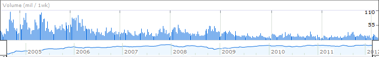
To get a sense of what these graphs look like we can borrow a commonly used graph from stock markets. Above is a section of a finance.google.com quote for Google’s stock giving you how many shares are traded over an 8-year period. Each vertical bar represents about 8 days of trading activity. This graph give you a history of the stock as it relates to overall volume of trading. Now imagine breaking this graph down to look at individual stock traders to see their personal influence over the overall trading volume. With the check-in sparklines visuzalition we’re going to be doing just that. We’ll be looking for historical context around check-in activity as it relates to all the major developers who’ve ever touched the code.
Check-in sparklines is presented in a tabular format with a single row per developer. Each row contains the name of the developer, a textual summary of their check-in activity, and a small bar chart that shows how many times they checked in code in a given month over the last few years. Such small charts that are inlined in a table and repeated per row are called sparklines, a term coined by Edware Tufte.
The developer charts have a bar for each month showing the number of check-ins in that month. The rightmost bar represents the current month, with bars towards the left going further into the past. Given the size of the chart it is not possible to put axes, never mind ticks and labels, into the chart. Therefore, the bars representing check-ins for January are shown in a different shade to help the viewer with the x-axis, and the vertical scaling is the same in every chart, with a description at top of the table explaining the range.
{ed: do we do references? or we just name people like Tufte?} {jm: I think we can add him to the bibliography and apply a footnote…for now let’s not worry about it until we get our final production system with the publisher}
Example: ArgoUML
Checkin sparklines for the ArgoUML codebase
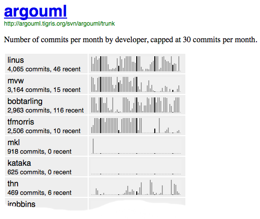
The sparkline charts for the ArgoUML project show the check-in history per developer over the last five years, with each bar representing the number of check-ins in a given month. The bar representing the month in which the chart was generated is located on the right hand side of the diagram, with previous months extending to the left. Because the sparklines are too small to provide room for axes or ticks the bars for January are shown in a darker shade to give the viewer some minimal navigation help. Given that the fifth bar from the right is shaded black it is clear that the chart was generated in May. The sparklines for each developer are sorted by the total number of check-ins over the entire length of the revision history of the project, which exceeds five years.
It is quite obvious that four developers have been very active in the last five years. Two of them, linus and bobtarling, have check-ins almost every month across the five years and in many cases the bars reach the maximum, signifying 30 or more check-ins in the given month. Two more developers, mvw and tfmorris, have very significant numbers of check-ins, too, but their activity seems to have decreased over the past two years. The change in check-in activity in tfmorris’s case is quite abrupt, dropped from almost completely full bars to nothing for a few months about two years ago.
The ArgoUML project is older than five years and it is interesting to see that contributor number 5 and 6, that is mkl and kataka, show next to no commits in the charts. They must have been involved earlier and then dropped out of the project. The sparkline for thn show yet another kind of involvement with the project. He or she has been involved lightly over the years, never making many check-ins in any single month but consistently checking in over at least the last five years.
{ed: would like another example with a more typical and meaningful set of contributors.} {jm: i fired up this code and found the java library JavaHG for importing Hg history, but didn’t get it all working. Was trying to get Firefox source history for comparsion…then I thought an actual real-world enterprise repo is a better idea than another open-source example. This we should see if we can get client examples to be published from TWs projects to add more color. }
How it works
Check-in sparklines works by showcasing individual developer activity compared to their peers. A key difference to other visualisations is that there is no obvious way to aggregate the activity in a meaningful way. Instead, it is the pattern of the data points as we look across individual developers that we are interested in.
Information density
The constraints described above make it clear that we need a graph per developer and the graph needs to show a large set of data points. The only way to make this possible is to reduce the size of the individual graphs and increase the information to pixel ratio as much as possible.
The information to pixel ratio describes the ratio between the total number of pixels in the graph and the number of data points shown. Many charts acompanying business presentations for example fill an entire presentation slide but only contain 10-20 data points. The ratio for those kinds of business presetations is quite low, 20 points shown in a chart measuring maybe 800x400 pixels, which correspond to a ratio of 1:16000. In contrast, Check-in sparklines have an information to pixel ratio of 1:90, a few orders of magnitude higher, allowing us to create a visualization that exposes trends and patterns that would otherwise be hard to see.
{ed: I need to double-check this with the Tufte book}
Reducing the size and increasing the density of the chart is achieved in two ways. Firstly, the graphs are shown without axes, ticks, or labels, because each graph uses the same scale and a textual description above the graphs can be used to explain the scale. Ticks and grid lines on the x-axis are replaced by marking the bars representing the data. As described before, the bar representing the data for January is shown in a different shade to visually mark a year. Another optimisation employed is to represent 0 values by a bar of minimal height. This, together with the shading, helps effectively to recreate the x-axis for time.
Secondly, the actual bars are quite small, only measuring two pixels in width and a maximum of 30 pixels in height. This is possible because we’re not so much interested in reading the exact value at a precise point in time, in which case the bars would have to be bigger and some horizontal grid lines would be needed. Instead the we’re interested in the shape of the overall graph, the patterns of the bars, and having tiny bars close to each other make it easier to see the patterns.
Layout
The sparkline graphs need to be arranged on the page. For the example visualization we have chosen a simple tabular structure with one chart per row, with the charts sorted by total number of commits. This is a good default layout, because it ranks the most active developers at the top of the stack.
Alternatively, when more commiters are relevant, it is possible to reduce the textual information per developer and tile a larger area with the sparklines charts. Given that two dimensions are of interest, namely the total number of commits and the number of recent commits, it is also possible to arrange the sparklines in a pattern where the x and y position of the sparkline chart itself roughly corresponds to the number of commits, total and recent. The following chart demonstrates this idea.
{jm: I think something is missing here… was there another chart that was going to be included to demonstrate layout of sparklines in this scenario? Also, I was confused if there were more than one alternative here…1) drop textual info & increase tile area and 2) arrange into pattern where x&y position correspond to commits - total & recent}
Variations
Excel
Using Micosoft Excel it’s possible to generate an even denser graph. One that has no gaps, no January shading, and graphs a trend line inside a spreadsheet cell. Other refinement possible is to shade or highlight low and high points to demonstrate points in time when there was the least and most activity. Can also do win/loss, ie. first order derived.
{jm: didn’t understand the win/loss and first order derived comment…need to explain this and perhaps even add one more graph to show this off.}
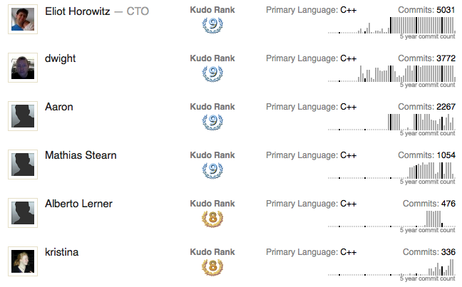
Ohloh.Net
Ohloh.net demonstrates how to use additional information in the form of graphics, like avatar and “kudos”, as well as one other key pieces of information like the programming language of the contributor.
Implementation Notes
Possible Tools: Custom Script/Program
Requirements: Source code history
As with many other visualisations the check-in sparklines are created with a three-step process, data acquisition, transformation, and visualisation. In this example we’ll write our own Java program to orcastrate all three steps.
Data Acquisition
Getting the check-in data is very specific to the source control management system used. For the example we used Subversion and a Java library that can directly interact with a Subversion server. A more low-tech approach would have been to use a standard Subversion client to retrieve a check-in (commit) log and then parse the textual representation.
Transformation
Once the commit data is acquired into the program, it’s then transformed into individual developer objects to hold their personal commit history. The other vital information is the time line of how far back the repository goes, which will set our x-axis in our next to graph the transformed data.
Visualization
There is a multitude of tools and toolkits to render bar charts, some of which are flexible enough to render a chart as stripped down as a sparkline. However, arranging a large number of individual charts on a page is not as easy, and with most tools some post-processing would be needed. At the same time the sparkline charts are so simple that even with a basic drawing library they are straight forward to generate.
For the example charts we have taken a two step process using different, but standard, technologies. The sparklines are rendered as bitmapped images using the Java AWT library. The actual drawing code comes in at about 50 lines of code. We’re setting the width of the bars to two pixels and each commit is represented as one pixel in height, with a pre-defined cap. The image is generated in a standard AWT BufferedImage.
private static final int BAR_WIDTH = 2;

public Sparkline(int months, int cap) {
    width = months * (BAR_WIDTH + 1);
    height = cap;
    image = new BufferedImage(width, height, BufferedImage.TYPE_INT_RGB);
    graphics = image.createGraphics();
}
The public drawing method takes a list of DataPoints, which hold the number of commits as value and indicate whether the point is to be considered a tick mark. The method draws the background and then iterates over the points to be drawn.
public RenderedImage render(List<DataPoint> points) {
    graphics.setColor(new Color(240, 240, 240));
    graphics.fillRect(0, 0, width, height);
    int x = 0;
    for (DataPoint point : points) {
        drawBar(x++, point);
    }
    return image;
}
The drawBar method is equally straight-forward, first choosing the colour based and then drawing the bar. What is noteworthy is the handling of datapoints that are empty, i.e. represent zero commits. Rather than drawing no bar at all, we are drawing a one pixel grey bar, which gives the impression of an x-axis even in sparsly populated sparklines.
private void drawBar(int x, DataPoint point) {
    Color color;
    if (point.isTick()) {
        color = Color.black;
    } else if (point.getValue() == null) {
        color = Color.lightGray;
    } else {
        color = new Color(160, 160, 160);
    }
    graphics.setColor(color);

    int barHeight = point.getValue() != null ? point.getValue() : 1;
    graphics.fillRect(x * (BAR_WIDTH + 1), height - barHeight, BAR_WIDTH, barHeight);
}
The images are written to individual files. The composition of the images with the surrounding text is done using HTML, which is generated by a standard templating solution, Freemarker in this case. The Java code passes a collection of simple model objects representing the developers to the template, which then iterates over these and creates a regular HTML table. Images are included based on a naming convention.
<table id="developer-table">
[#list developers as developer]
    <tr>
        <td>
            ${developer.name}<br>
            <small>${developer.numberOfCommits} commits, ${developer.numberOfRecentCommits} recent</small>
        </td>
        <td>
            <img src="sparkline-${developer.name}.png" alt="sparkline for ${developer.name}">
        </td>
    </tr>
[/#list]
</table>
To give the table a compact look and make it match the colour of the generated images a stylesheet is defined:
#developer-table tr {
    padding: 0;
}

#developer-table td {
    text-align: left;
    font-family: Sans-serif;
    vertical-align: bottom;
    padding: 5px 0.5em 0 5px;
    background: #EEE
}
The code can be used standalone to produce a package of files representing the sparklines. Alternatively, this can obviously be wrapped nicely into a web app.