Code Ownership Distribution Map
Who owns the codebase?
Imagine going on two week vacation to some tropical island and leaving all your work behind to enjoy sea breeze and palm trees. Picture yourself free from thinking about work as you’re sure that your colleagues are taking care of everything while you are away. No it’s not just a dream - your code and team can work this way - the secret is collective code ownership.
By having everyone on the team understand all parts of the codebase it leads to more consistenty in how code is written. You’re also protecting your project from developers leaving with critical knowledge as well as helping bring on new developers to your team. As collective ownership increases, this has a natural effect on increasing reuse of existing code because developers are aware of how to leverage each other’s work.
Sustainable code requires collective ownership of the codebase. The code ownership distribution map allows you to quickly determine if what parts of your codebase are largely owned by the team and which areas have only a single committer.
What You’ll See
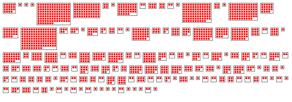
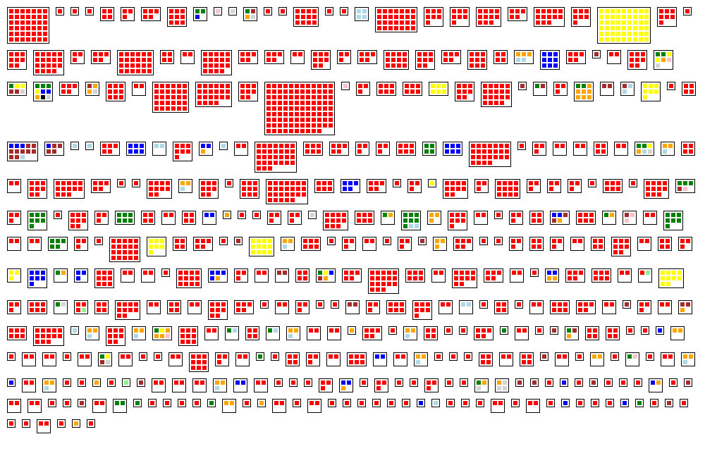
The example above is a snippet of Notepad++, an open source text editing program for Windows. The black rectangles represent a particular directory in the codebase, while the colored squares are individual source code files. The color represents ownership, with red indicating that the file is owned by a single committer while green shows files that are owned by the team. Large codebases will produce a very large image, but the color will give you a nice big picture view of ownership.
As you can see it’s clear that large parts of this code are owned by single individuals, something that is not uncommon for open-source projects. It’s important to see that the color does not equate to specific developers, but ownership in general. Concentrated code ownership like this reduces overall maintainability, as the knowledge and expertise of how to modify and change different parts rests in individual minds instead of a shared context.
Let’s take a look at how we might use one of these distribution maps to help us make better decisions about building better software.
Example: myBatis & Hibernate
Hibernate and myBatis (formerly iBatis) are both popular open-source Object-Relational Mapper (ORM). Let’s assume we’re evaluating whether your team wants to use either myBastis or Hibernate on our project. In addition to making the usual comparisons around features, performance, security, syntax and support we’d also want to get a sense of the maintainability of the codebase. One of the questions we’d ask is who owns the codebase for each project.
We’ll use a codebase ownership distribution map to help identify areas that have high ownership and compare these two codebases on this dimension. Note that since Hibernate and iBatis use different version control systems (Git and Subversion respectively), we used the older Hibernate repository from October 2010 as a source of comparison.
First let’s take a look at Hiberate’s code ownership:
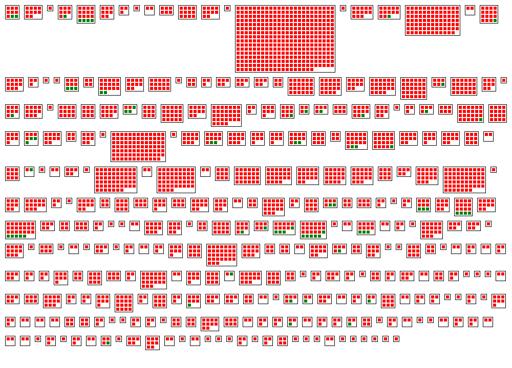
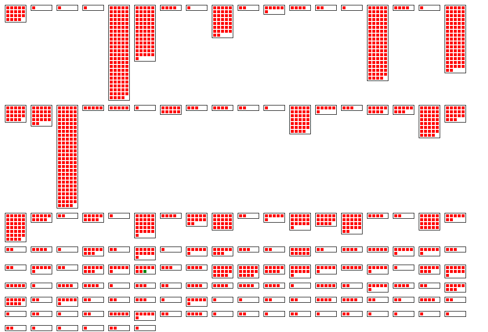
In this representation the red boxes are classes where 50% of the check-ins are from a single committer. Green boxes represent the inverse - the classes have mostly been modified by more than one committer, indicating team ownership. As you can see it appears that most of the code is owned by single developers, but there are portions that show up as green indicating collective ownership. As a quick visual check it appears that approximately 15 packages have some team ownership characteristics. From a total of 326 this might not seem a lot, about 4.5%, but before we make any conclusions let’s take a look at myBatis.
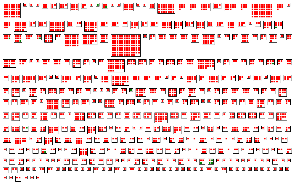
Unfortunately in MyBatis’s case the situation doesn’t look any better, in fact we see a lot more distribution of single committer ownership across the code base. The code has significantly more packages, about 100 more, but green box distribution seems to be around the same number of packages as Hibernate, giving this one about a 2.7% team ownership distribution.
Overall, neither seem excellent candidates for collective ownership but as far as which one is in the minds of more developers who have contributed to them Hibernate has the clear advantage.
With this example in hands, let’s take a look at how this visualization works.
How It Works
We determine ownership based on how often each file is checked in by every team member. With this data we can then start to graph the distribution map.
In the simplest case, as we did the in Hibernate vs. MyBatis example, we used a commit threshold of 50% and only looked at single vs. team ownership. This determined if a class was drawn in red (single owner) or green (team ownership). Choosing a commit threshold percentage (i.e. 50%) is somewhat arbitrary. If we choose a lower percentage the maps gets progressively more gray, but we also lower the bar for what team ownership means. Conversely, if we increase this percentage the standard for team ownership goes up but might be less realistic for larger codebases, especially in the open source world. We want to find the happy medium between these two.
Variations
One way to vary the above distribution map is to assign unique colors to each committer. This will call out ownership of each contributor to see how spread out the knowledge amongst the team. For example, it might show that one developer has really concentrated knowledge of two areas of the codebase, but nothing in the other areas.
Example: myBatis & Hibernate revisited
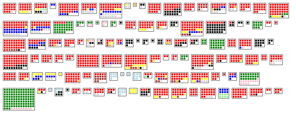
Looking at Hibernate again, this time assigning individuals colors to the committers who own the classes, produces the following distribution map:
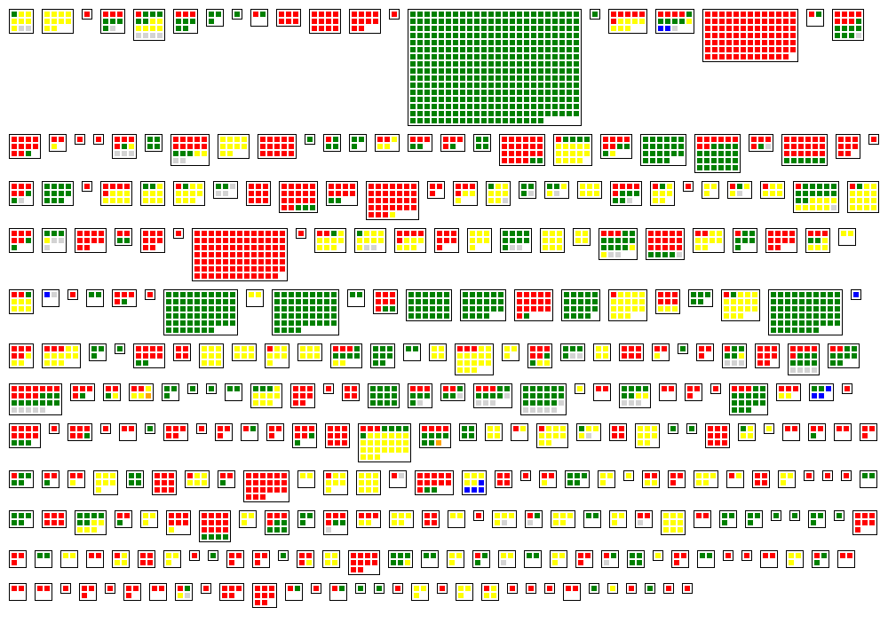
Most of the classes that have individual code ownership are either red, green, or yellow, making us aware that this codebase has three major committers. Only a very small number of classes is blue, hinting at a fourth developer who has committed code.
The distribution map colored with individual committers tells us something else about Hibernate, namely that code ownership on this project often goes beyond the class level. In several directories, smaller and larger, a vast majority of the classes, if not all, have the same color, indicating that an individual committers own the entire package. In some ways this codebase looks like the work of three developers that has been thrown together in one project.
Creating the same map for myBatis shows a very different picture:
The map is dominated by red, clearly representing a strong lead developer. Several other developers are visible, sometimes owning small to medium sized packages, and sometimes collaborating on packages. Interestingly, there are no occurrences where one of these developers owns a class in a package that is owned by the lead developer.
Looking at individual owners reveals some interesting distinctions between the Hibernate and myBatis codebase ownership structure.
Implementation Notes
Possible Tools: Custom Script/Program
Requirements: Source code history
To get this visualization started we’ll first need to collect a detailed repository history. In our example above we extract subversion log history using the subversion command line tool.
svn log repo_url -v --xml > svn_dump.log
If you’ve installed the svn command on your Windows or Unix machine you can pull the log files by specifying the location of the repository, the verbose switch (-v), and the XML output option (–xml). We chose the XML format as it will be easier to read by an application than the default text format. Below is the command that pulls the Hibernate repository history and dumps it into a local log file.
svn log http://anonsvn.jboss.org/repos/hibernate/search/trunk/ -v --xml > hibernate_svn_dump.log
After collecting the log history, we then turn our efforts towards creating the distribution map from it. In this case, no tooling was available to help us with this so we have to write a custom program to do the work for us.
The implementation has a simple parser that reads the XML output from the Subversion command and groups the log entries by directories, authors, and commits across the entire history. Another class takes the entries and calculates ownership. This information is taken by a third class that draws the diagram using the GDI Windows Graphing library. All this wrapped up into a console application that takes the subversion log files as input and produces an PNG file as a result.
The only class that contains noteworthy implementation details is the graphing class. In our implementation we have chosen to layout the directories in rows, left to right, with the rows starting from the top. Complexity is added because the directories can contain vastly differing numbers of classes, ranging between 1 and over 350 in the Hibernate example. Fixing the width of the box to a size that makes sense even for smaller packages, to 5 classes for example, and growing the box as tall as it needs to be to contain all classes is simple but it results in a few very tall boxes, which in turn spread the rows apart and produce a disjointed looking graph that does not make good use of the space available. The following picture shows an early version of our algorithm that implemented this idea:
To improve the aesthetic value and use of space we turned to an algorithm that sizes boxes better. Approximating squares would have been an option but keeping the aesthetic angle in view we decided on something different.
Directory box ratio calculation
The Golden Ratio has been used since antiquity to create pleasantly sized rectangles. In such a rectangle the ratio of the width to the height is the same as the ratio of the sum of the with and height to the width, i.e. w/h = (w+h)/w. Solving the equation we get a ratio of approximately 1:1.6.
Finding the ideal width and height for a given number of classes in a directory is straightforward, but further complication is added because the numbers need to be integers - we can’t draw fractional squares - and there are only certain rectangles that have the golden ratio, especially at small sizes. The following table includes rounding which means some rectangles even deviate quite a bit from the Golden ratio.
| width | height | space |
| 2 | 1 | 2 |
| 3 | 2 | 6 |
| 5 | 3 | 15 |
| 6 | 4 | 24 |
| 8 | 5 | 45 |
It gets worse. Using the closest fitting rectangle from the above list would create many cases in which a large part of the surrounding box would remain empty. For example, rendering 16 rectangles in the smallest box that fits 16, a box 6 wide and 4 tall, would leave more than a row unused at the bottom of the box.
Following advice on the matter from Edward Tufte’s book the algorithm we implemented adds a few more possible boxes with aspect ratios between the Golden ratio and a ratio of 1:2. In detail it calculates the width and height according to the Golden ratio, which are fractional, and rounds these down. Based on these values for w and h it considers rectangles with these sizes: (w+1, h), (w, h+1), (w-1, h+1), (w+1, h+1). From this list the algorithm discards all rectangles that are either too small or have a ratio outside the desired range. The winning rectangle is the smallest of the remaining rectangles.
Color choice
For the variant described above colors have to be assigned to individual developers. This could be done at random but we have decided to follow a theory of colors. Through linguistic research a sequence of importance has been established for colors. Red is the most important color, followed by green, and yellow. We use red for the committer with the largest number of files owned, green and yellow for the developers with the second and third largest number of files owned, and so on. The following image shows the exact colors we use:
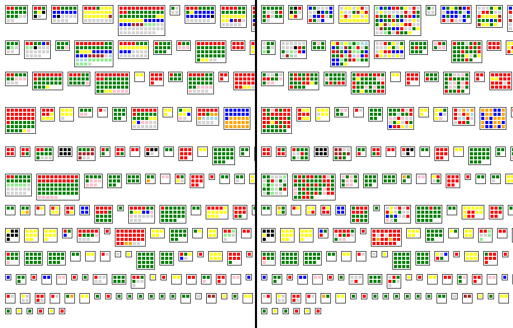
It is known that humans can only reliably distinguish about ten colors in a single diagram. For this reason, in code bases where we find more than ten committers, we use black for all committers beyond the first 10. This can be seen in the following map that represents a section of the Spring framework.
Sorting the classes
Within each directory we sort the classes by owner, starting each time with the owner that globally owns the most files, and who is, given the color choice represented by red. Not sorting the classes in each directory would make it much more difficult to assess ownership distribution within a directory, as this comparison from the Cruisecontrol Dashboard project shows.
Further Reading / References
- Stéphane Ducasse, Tudor Gîrba, and Adrian Kuhn. Distribution Map. In Proceedings of 22nd IEEE International Conference on Software Maintenance (ICSM ‘06), p. 203—212, IEEE Computer Society, Los Alamitos CA, 2006. (PDF)